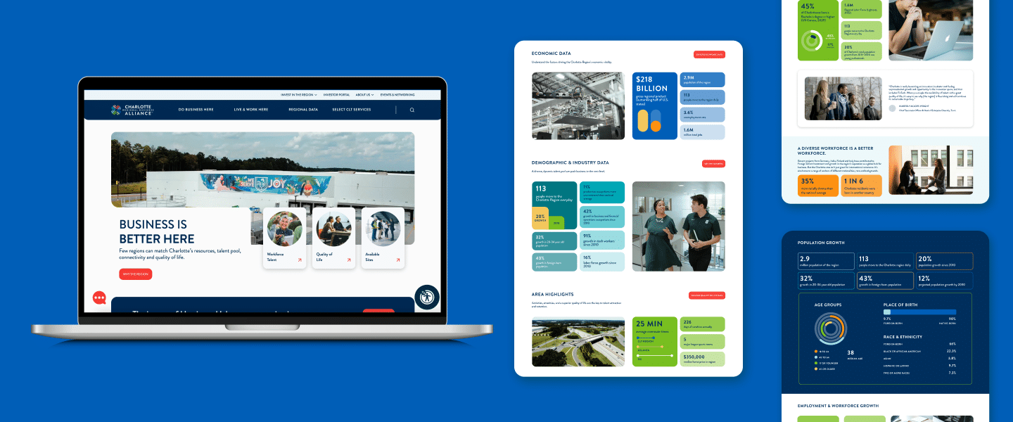
A website is the front door to a brand — or in this case, a region. And for businesses looking to relocate or expand to a new area, it’s a vital hub for making a good impression and arming prospects with the information they need for consideration. When our client, the Charlotte Regional Business Alliance (CLT Alliance), wanted to revamp one of its primary tools for business recruitment, the Mythic team couldn’t have been more excited to help showcase all the things we love about working and living in the Queen City in developing and launching their new website.
As the primary authority responsible for attracting business to the Charlotte Region, the CLT Alliance wanted to enhance its website with two goals in mind: 1) position the region as the premier place to do business and live, and 2) position the organization as the collaborative, go-to partner for site selectors, decision-makers and community leaders, and prospective talent.
The Mythic strategy team dove in, combing through competing regions’ websites and conducting stakeholder interviews with the internal CLT Alliance team. While they found that competitors’ websites are filled with data, they lack a cohesive narrative. Meanwhile, the team uncovered that the biggest strength of the CLT Alliance was, in fact, connection. With these new findings, our strategy became clear: create a compelling brand narrative demonstrating the business and lifestyle advantages created from the collective strengths of the 14 counties, while showcasing the value the CLT Alliance brings by streamlining the economic development process.
Building on our existing placemaking expertise, with these new learnings Mythic got to work crafting an information architecture that ensured the story we were creating maintained a balance of driving consideration for relocation and driving awareness of the CLT Alliance’s support programs. Every move was made with intention, organizing the site’s content by leveraging category trends to provide a strong, simple, and straightforward experience.
With the blueprints in place, the design and development teams focused on content development, user experience and design. It was important to elevate the strong data with context to more clearly define why the Charlotte Region was stronger than its competitors. This meant ensuring the UX was action-oriented, rather than passive, and data visualization was dynamic. By layering color, animation, and uniquely designed interactive modules, Mythic ensured the proof points caught the eye of our target audience.
Launched on Oct. 1, the new CharlotteRegion.com, with a stand-out design backed by a research-based site execution, offers quick fact-finding, intuitive navigation, a seamless UX and a connected story. The website truly showcases the strength of the Charlotte Region and informs site selectors, decision makers, community leaders, and talent from all over the country how connected, multifaceted, and advantageous it is. This site is a testament to the pride we take in our work, as well as the region we call home.
