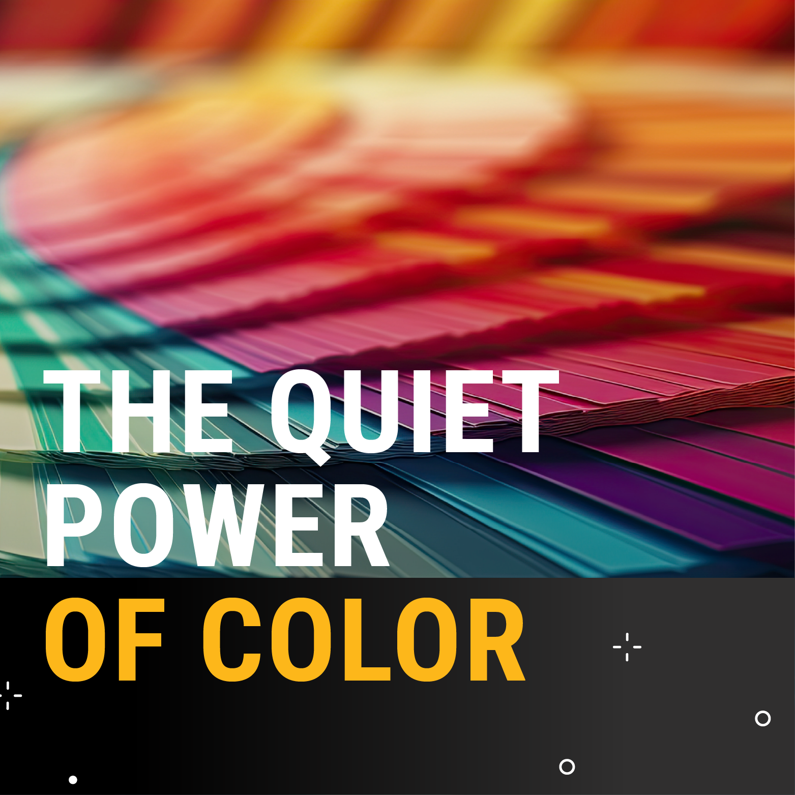
We live in a world awash in color, from the vibrant hues of city lights to the subtle undertones of a morning coffee mug. But what if these seemingly innocuous palette choices are more than just aesthetic flourishes? What if, in fact, they are potent psychological triggers, silently shaping perceptions, influencing moods, and ultimately, dictating consumer behavior?
In the realm of consumer psychology, few elements wield as much silent sway as color. More than a design decision, color is a strategic weapon for brands as well as an imperceptible architect of our daily emotional landscape.
Consider the ubiquitous stop sign, its cherry red commanding immediate attention and signaling urgency. The color wasn’t an accidental choice made by the stop sign makers of the world. Red was strategically chosen for the traffic sign as it signifies a call to action, a request for an urgent action, across many cultures. Retailers frequently deploy bright red on signage during sales events, leveraging the color’s inherent urgency to encourage impulse buys (guilty!). A “SALE” sign in bold red jolts shoppers into action and creates a fleeting sense of “now or never” as an endorphin rush is triggered by the juicy color, especially when paired with a reward-promising word.
The intricate dance of color extends to brand recall and purchasing behavior, making it a cornerstone of successful marketing. Think of Coca-Cola's iconic red and white. It's not just a logo; it's a feeling – energetic, classic, universally recognized. Brands understand that a consistent and thoughtfully chosen color palette can forge a powerful link between a product and a consumer's memory. When confronted with a sea of choices, the familiar hue acts as a visual shorthand, prompting recognition and often, a predisposition to purchase. Recognition = Familiarity = Trust.
The nuances within a color family — shades, values and variations — can further fine-tune a color’s psychological impact. Take blue, for instance. A rich, saturated navy can convey trust, professionalism, and sophistication, and is therefore often favored by financial institutions and tech companies. A lighter, sky blue, however, might evoke feelings of openness, freshness and creativity, making it popular for spas or eco-friendly brands. The subtle shift in saturation or shade can transform a color's message entirely, allowing for a precise targeting of desired emotional responses.
And what about cultural color trends? Do those affect brand identity? Pantone chooses its annual color after a team of “color anthropologists” from diverse backgrounds meticulously research the cultural landscape, scouring for subtle and overt signals that point to an emerging color narrative. As Laurie Pressman, Vice President of the Pantone Color Institute, recently told Graphic Design USA, the Color of the Year "reflects what is taking place in our global culture, expressing what people are looking for that color can hope to answer." While the Color of the Year undoubtedly influences product development and purchasing decisions across countless industries (from fashion and home furnishings to graphic design and product packaging), its core purpose, established in 1999, is to foster a global conversation about color. It's about drawing attention to the profound relationship between culture and the hues that surround us, and reflects what people globally are seeking, what they feel they need.
A current trend might favor earthy, muted tones over vibrant, saturated ones, reflecting a cultural leaning towards authenticity, sustainability or a desire for "quiet luxury." Pantone’s 2025 Color of the Year is Mocha Mousse, which suggests warmth, comfort and a touch of indulgence, aligning with a potential societal craving for simple pleasures and grounding amidst a turbulent world. Brands selling artisanal goods or eco-conscious products might leverage these softer palettes (ala Mocha Mousse) to reinforce their values.
Knowing the target audience is the bridge between cultural color trends and brand identity. Color trends can have diverse interpretations depending on the culture. Different colors also appeal to some demographics more than others (think kid preferred colors vs. adult preferences), so a strong understanding of the nuances of an audience will play into the colors that dress a brand. You likely wouldn’t use hot pink on a logo for high-end, luxury brands like Rolex or Rolls-Royce. For an ad agency, color cannot be an arbitrary choice; it must be a calculated decision rooted in deep knowledge of the brand’s desired positioning and the emotions it aims to elicit in its target audience.
Key considerations when choosing brand colors:
- Target audience demographics
- Brand perception (fun, sophisticated, loud, powerful, young, etc)
- Location of brand presence (different areas can have different preferences)
- Desired emotion (soothing vs energizing)
In a world increasingly saturated with visual stimuli, color remains one of the most impactful tools in the arsenal of persuasion. From the calming blues of a healthcare office to the urgent reds of a sale sign, these chromatic clues are silently guiding consumer choices, shaping moods and ultimately influencing the day-to-day decisions of a consumer-driven society. The next time you feel yourself “unexpectedly” drawn to a particular product or feeling a distinct emotion in a physical space, take a pause to consider the silent architect at play: color.
At Mythic, creativity is at the heart of everything we do. From innovative design and brand storytelling to compelling campaigns and immersive experiences, we bring your vision to life in ways that captivate and inspire. Our team of creative experts blends strategy with artistry to deliver memorable, results-driven solutions that resonate with your audience.
Ready to bring your creative ideas to life and become an unstoppable force for growth? Reach out to newbiz@mythic.us to get started.


