

If your email design isn’t accessible, you aren’t just being exclusive; you’re voluntarily leaving potential revenue on the table by locking out users who rely on features like screen readers or other adaptive settings.
In the high-stakes world of digital marketing, we obsess over open rates, click-throughs, and attribution models. Yet, a staggering percentage of brands are ghosting their most loyal fans through technical exclusion. When an email fails to render for a screen reader or washes out in high-contrast mode, the message to the customer is clear: This wasn’t built for you.
Moving beyond the checkbox
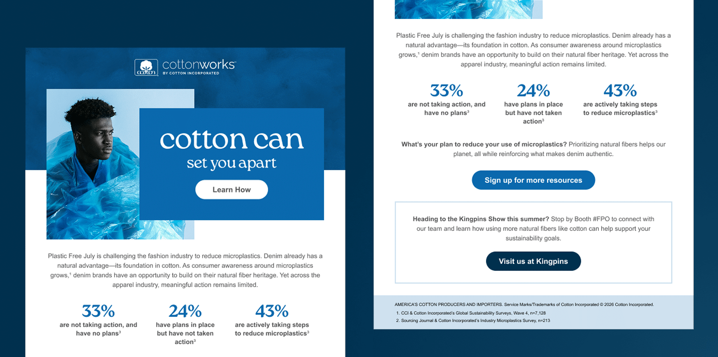
For too long, accessibility has been treated as the final to-do before a campaign goes live; a quick alt-text check or a color contrast pass. This “checkbox” mentality is a symptom of a deeper problem: viewing accessibility as a legal hurdle rather than a core design discipline. When accessibility is treated as an afterthought, technical debt accumulates rapidly, often manifesting in the common “all-image trap.” This occurs when brands send visually stunning emails comprised of a single massive image; to a screen reader, this content is a blank void, while to a user with a slow connection, it is merely a broken box devoid of any contextual clues.
This lack of foresight can also lead to nested table nightmares. Because email development historically relied on complex tables within tables, failing to include proper semantic roles (such as role=”presentation”) forces screen readers to painstakingly announce every structural row and column. This technical noise effectively buries the actual message under a mountain of unnecessary code. Furthermore, a contrast crisis often emerges when aesthetics favor subtle grays or trendy, low-contrast palettes. These design choices become entirely unreadable for the significant portion of the population living with color vision deficiency, which includes roughly 1 in 12 men and 1 in 200 women. Good design is truly only effective if it is actually legible.
Inclusion as an ROI engine
The most immediate ROI of inclusive design is the dramatic expansion of your reachable audience. Much like physical curb cuts (originally designed for wheelchair use) ended up benefiting parents with strollers and travelers with luggage, digital accessibility improves the experience for everyone. Research indicates that products built with accessibility in mind can reach up to 4 times as many consumers as those that aren’t. By making an email or interface accessible, you aren’t just serving the 15-20% of the population with permanent disabilities. You’re capturing users in situational or temporary disability states, such as someone trying to read a screen in bright sunlight or a person with a broken dominant hand.
Moreover, the financial impact of inclusion is measurable and significant. A recent global study found that inclusive marketing drives a sales uplift of over 16% compared to less progressive content. Furthermore, companies that consistently prioritize accessibility have seen their revenue increase by up to 28%. In the specific world of email, accessible design, which prioritizes clean code and low cognitive load, directly feeds into better deliverability. When your emails are easier to parse, engagement metrics like click-through rates (CTR) improve, signaling to inbox providers that your content is high-quality… and therefore, stays out of the spam folder!
Additionally, consumer expectations have hit a tipping point where inclusion is a prerequisite for loyalty. Approximately 75% of consumers globally report that a brand’s reputation for diversity and inclusion influences their purchasing decisions. For the younger demographic especially, accessibility is seen as a proxy for brand ethics; they’re 66% more likely to pay a premium for products from companies committed to social impact. When a brand takes the time to ensure their digital experience is seamless for everyone, they’re actively building a foundation of trust that drives long-term customer lifetime value.
Designing with intention
Truly inclusive design starts with viewing your HTML as a roadmap rather than just a layout. Instead of using styled code blocks purely for visual effect, we can use real headers to create a logical path through the story. This matters because many readers use assistive tools to skip from one headline to the next to find the information they need. When you remove those technical signposts, you’re essentially asking your audience to wade through a wall of text without a guide.
We also have to challenge the idea that high-contrast design is a creative limitation. In reality, bold typography and vibrant, accessible color palettes act as a superpower for your brand. High contrast isn’t just a technical requirement; it’s a tool for the customer trying to read your message on a bright screen in the midday sun. If the design forces a reader to squint, the friction is already high enough for them to look away.
Finally, the most effective way to ensure an email works is to test for how it feels, not just how it looks. While most teams check for “Dark Mode” rendering, the real test is seeing how a person interacts with the content. This means ensuring every link can be reached without a mouse and that image descriptions provide a meaningful narrative rather than a generic file name. When we stop and listen to how our code sounds through a screen reader, we can quickly identify where we’ve accidentally created a dead end for our customers.
Stop leaving money on the table
It’s time to stop ghosting your customers. By evolving your development process to include semantic tags, logical reading orders, and color-conscious palettes, you stop ignoring a massive segment of your audience and start inviting them in.
Ready to bridge the gap between aesthetics and accessibility? Give Mythic a shout at growth@mythic.us.